OFFER
OFFER


Images in email best practices: Best sizes and how to embed
With over 130+ pre-built integrations and flexible APIs, you can easily centralize data from across your tech stack
Make the most out of your data and unlock powerful growth marketing possibilities with these other top marketing tools.
Build any custom integration with our open, flexible APIs that are simple to use and implement.
Check out apps that have been stealing all the spotlight.
Email and SMS marketing insights, ecommerce resources, and the latest Omnisend news
Expert-led sessions covering email, SMS, and ecommerce marketing strategies.
Educational video and live training to help you make the most out of Omnisend.
Drive sales on autopilot with ecommerce-focused features
See FeaturesA well-crafted email CTA is essential for guiding readers towards taking action, directly influencing click-through rates and conversions.
Use clear, benefit-driven language in your CTAs to highlight value and encourage subscribers to engage with your offerings.
Create urgency in your CTAs by incorporating phrases that prompt immediate action, helping to prevent hesitation and drive faster conversions.
Strategically place your CTAs in emails—above the fold, in the middle, or at the end—to maximize visibility and effectiveness based on the email's content flow.
You’ve crafted the perfect email, but what happens next? The success of your campaign relies on one crucial element: the call to action. An email CTA is the final step in converting readers into customers, so it has to be relevant, action-driven, and visible.
This guide explains exactly what an email CTA is and how to create high-converting buttons that drive clicks, engagement, and conversions. We’ll show you how to write copy that gets results and where to place it for maximum impact.
To spark your creativity, we gathered 77 email CTA examples covering everything from promotional sends to abandoned cart reminders. Without further ado, let’s break down how to design CTAs that boost your click-through rates and increase your revenue.
A CTA is an essential element of your email that tells the readers what you’ve been building up to. It’s the final step of a section that tells them what they need to do next with the information they just received. Without it, your customer may feel confused or unsure about what just happened and what the purpose of the email was. To avoid that, you need to tell them explicitly what to do next and why they should do it.
If you leave people guessing, they will most likely close your message and move on to the next one. Your audience needs direction, and a well-placed button provides exactly that. When you strategically place and optimize your call to action, you’ll see a direct and measurable impact across your performance metrics:
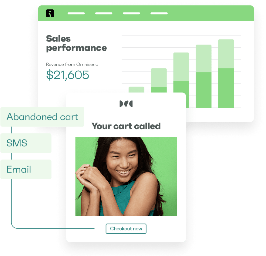
For ecommerce businesses, effective CTAs are critical to your overall growth strategy. Every promotional campaign you send, every abandoned cart reminder, every post-purchase message, and more, rely on a designated button that pushes traffic back to your store.
You’re constantly competing for attention, so you need to make sure that your email is made in a way that doesn’t require the reader to figure out what’s happening. It needs to have a simple and smooth flow that guides the subscriber from one thing to the next, and a CTA at the end of the copy will let them understand that they can get all the benefits they’ve just read if they click the button and make the purchase.
There’s no magic behind writing CTAs. It won’t make any difference if your content prior to it is weak, so to truly make your email valuable, first you need to focus on that. Then, follow a few simple rules that will allow you to consistently create CTA buttons that complement your email content and drive traffic to your store.
You may get intrusive thoughts about being unique and coming up with niche phrases or clever wordplays, but we recommend against that, unless your brand voice and audience warrant it.
Confusion is not the best solution, so stick with short, clear, and familiar phrases that people are used to seeing. This way, their brains will process it automatically, and there won’t be any questions. Otherwise, a confusing CTA may deter them from clicking altogether.
Here are some simple CTAs that work well and leave no room for misinterpretation:
Tell your audience precisely what you want them to do, and don’t make them decipher what you want to say.
People are more inclined to click something when they understand what’s in it for them. Rather than just telling them to perform a task, focus on the benefit they will receive. Benefit-driven CTAs highlight the value of taking action, which makes the choice to click much more appealing.
When you frame your button copy around their needs and desires, you naturally increase the likelihood of conversion. For example:
These ones focus on the exact value and benefit the product provides, which makes it easier for the customer to understand what they’re getting and connect to the product emotionally.
Knowing there’s a limited quantity of products or a discount that ends soon provides a better incentive to buy than when there are no restrictions on anything. A sense of urgency or a fear of missing out encourages customers to act immediately, because putting it off can result in missed deals.
To induce urgency in your CTAs, use phrases like this:
They communicate that if you don’t act now, you may not have a chance later. It’s a great way to prevent hesitation and drive faster conversions.
Long, complicated sentences belong in your email copy, not inside your buttons. Even in your copy, actually, it’s better to be concise and easy to understand. But if you need to use long sentences, do it in the email body instead, not the CTA.
For the button itself, stick to 2-4 short words. If your CTA is in text-only format in a simple email, and it warrants more information, you can use up to 20 words. The rule of thumb is to keep your message visually appealing and ensure that your audience can process the instruction instantly.
You need to make sure that your emails match your CTAs. For example, if you’re sending a welcome email, you may want to focus on introducing your brand and add an “Explore our story” CTA. Promotional emails, on the other hand, should focus on driving immediate action, so a “Claim your 20% off” CTA is a better fit.
In short, you need to check if the CTA matches the natural flow of the email and doesn’t come off too strong or too pushy.
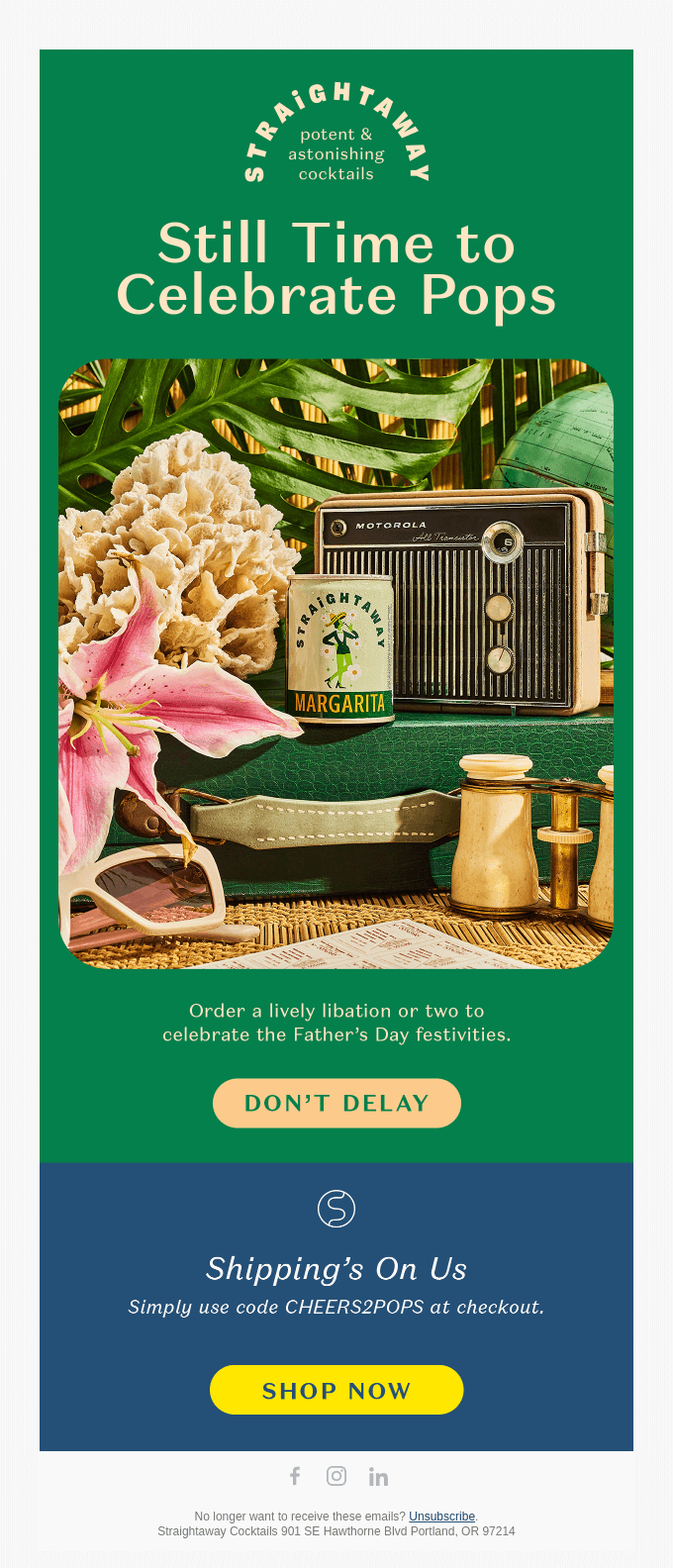
Here are 77 powerful call to action examples categorized by email type to inspire your next campaign.
Let’s take a closer look at 11 real-world email campaigns that use highly effective calls to action to drive engagement and sales.
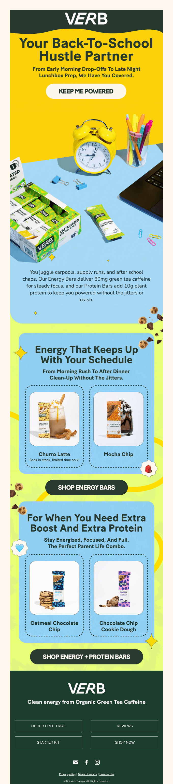
This benefit-driven button works because it focuses exactly on what the customer wants. Instead of a generic command, the copy highlights the direct value of making a purchase. It also flows perfectly with the entire back-to-school theme and offers stable and consistent energy throughout the day to support the various activities that students juggle daily.
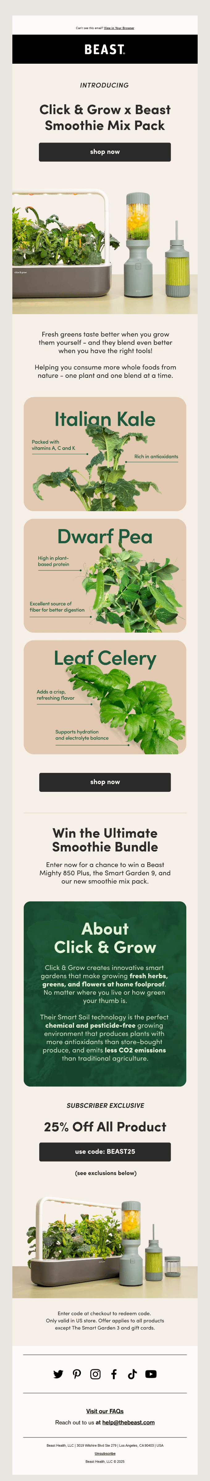
Sometimes there’s no need to reinvent the wheel, especially if your business is not all colorful and playful. In these cases, a simple “Shop now” does the job and requires zero brainstorming efforts to come up with a unique wording. It’s concise, familiar, and it takes the customer right where they expect to go.
Offering a bonus item is an excellent way to build your subscriber list. This straightforward button works seamlessly because the email copy already explains the value they’ll be getting. The call to action simply provides the final step needed to claim the reward. As a matter of fact, “Claim the reward” would also be a great alternative.
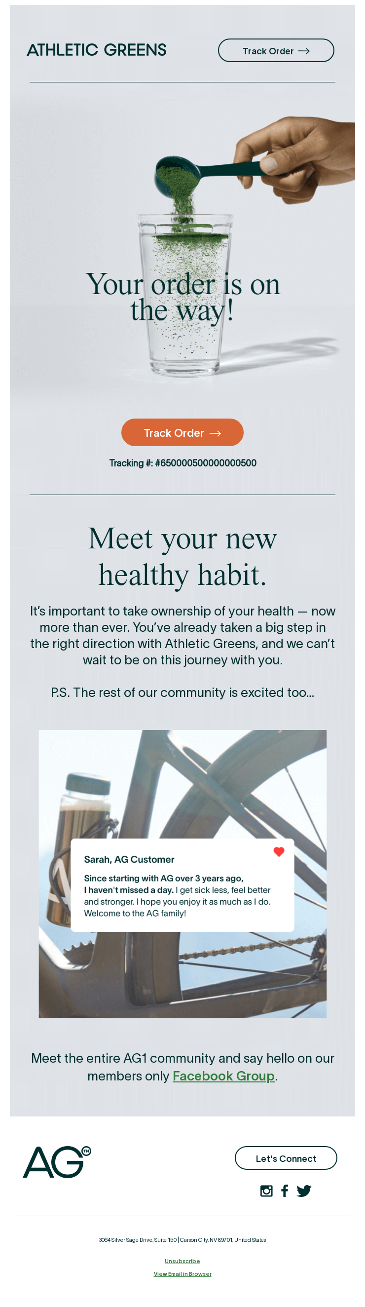
Transactional messages have some of the highest open rates, which makes clarity essential here. This button sets a very clear and positive experience for the customer by allowing them to track their order. Not every brand allows order tracking (some even use this email to upsell), so this email, along with the CTA, sets your brand up for a positive reinforcement and potential long-term retention.
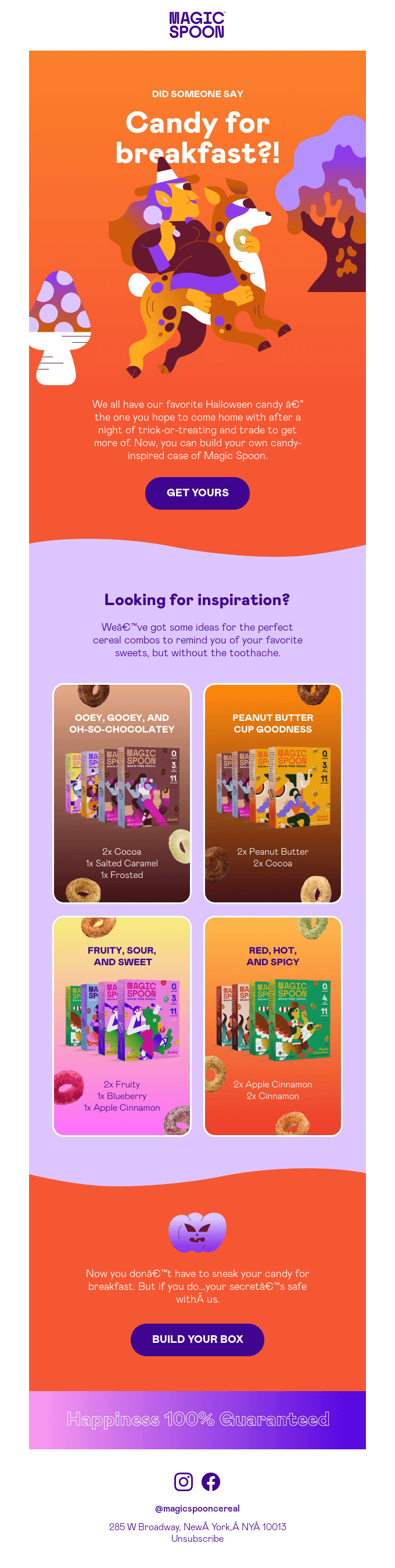
This phrase is perfect for promotions where you can get something unique instead of buying the same products as everyone else. It implies that you’ll be able to make your own selection and build your own bundle. It’s a short and punchy copy that easily guides the reader toward securing their own sweet treat in a conversational, outgoing way.
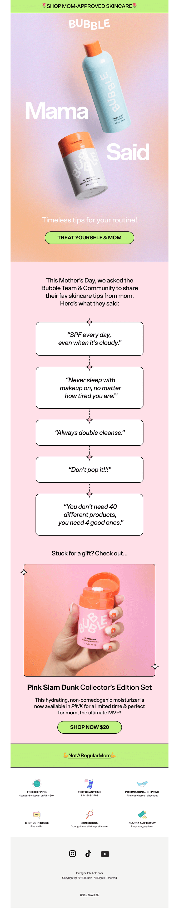
Mother’s Day campaigns often focus solely on gifting, but this copy encourages shoppers to buy something for themselves, too. It’s highly specific to the holiday and offers a dual benefit. This approach not only makes the purchase feel justified but also increases the potential order value, which is a win-win for both parties.
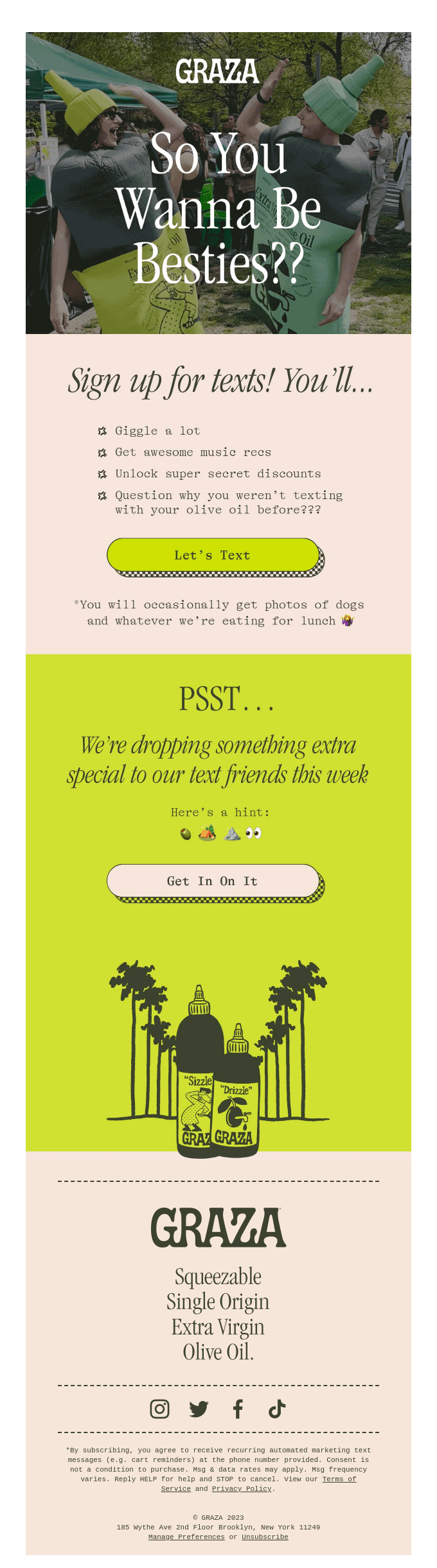
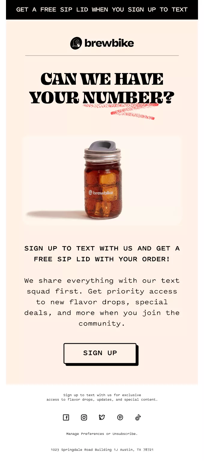
Growing your SMS list requires a friendly and low-pressure approach, and this call to action sounds like an invitation from a friend rather than a marketing command. By the way, Omnisend offers global SMS marketing features, which allow you to reach customers internationally with these exact types of conversational campaigns.
Creating a sense of urgency is a proven method to increase your conversion rates. This button copy pushes the subscriber to act quickly before it’s too late to get free shipping. It effectively prevents procrastination without sounding overly aggressive or sales-heavy.
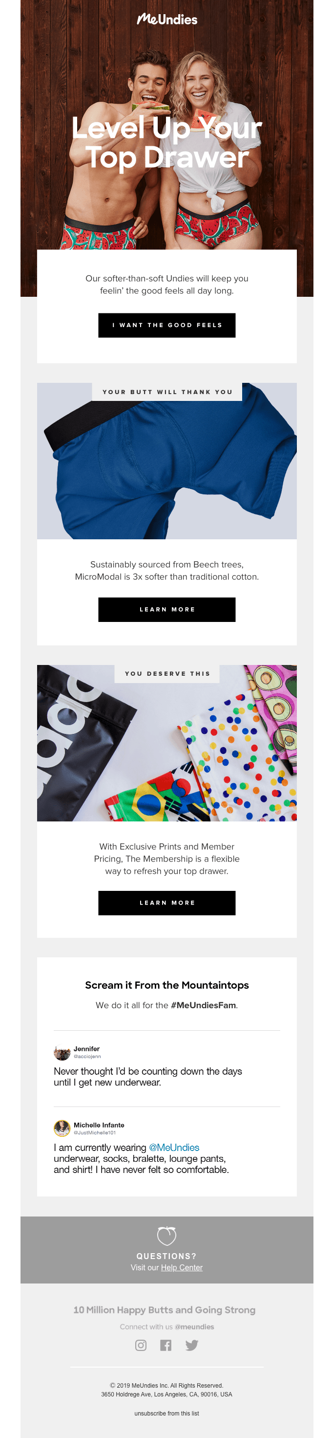
Injecting brand personality into your buttons can make your messages much more memorable. This first-person statement is fun, unique, and highly engaging. It forces the reader to agree with a positive sentiment, making the decision to click feel natural and emotionally rewarding.
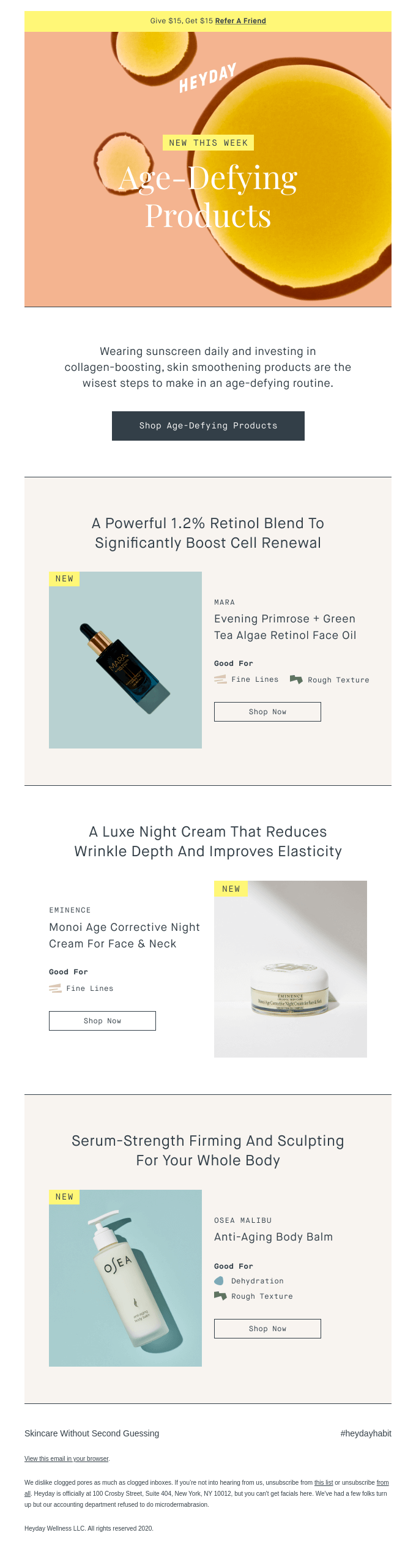
Being highly specific with your instructions ensures the right people click through to your store. This descriptive copy tells the reader exactly what category of items they will find on the next page. It perfectly matches the email’s content and sets expectations for the entire shopping experience.
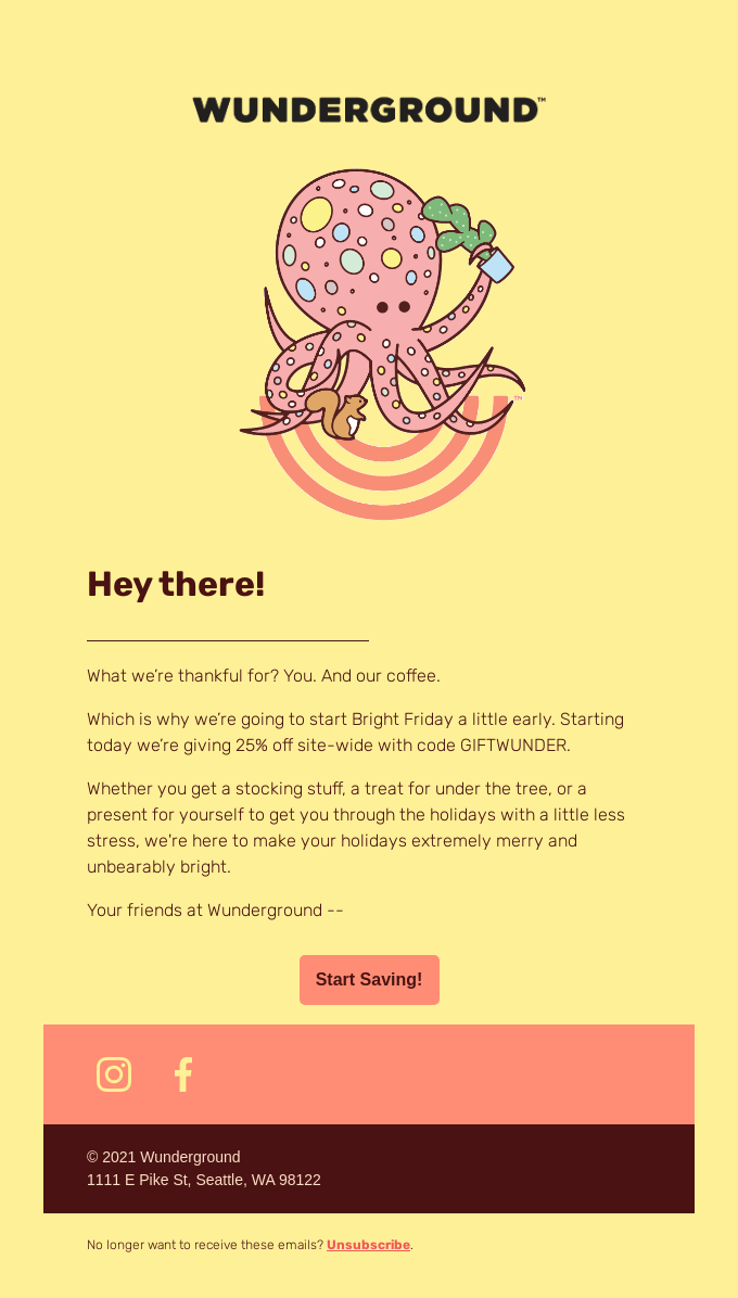
Everyone loves a good discount, and this button places the primary benefit front and center. Instead of focusing on the act of shopping, it emphasizes the financial reward of taking action. The exclamation point also adds a subtle touch of excitement and enthusiasm to the promotional offer.
The position of your button is just as important as the copy you write, so strategic placement is vital for driving clicks. Here are the best options for placing your CTAs in emails.
Placing your button above the fold means it’s instantly visible without the reader having to scroll down. This is the most valuable real estate in your campaign since people are busy, and many will only glance at your message for a few seconds.
By putting your primary offer right at the top, you immediately grab their attention. This prime positioning ensures that even the quickest scanners see your main goal or offer, which makes it incredibly effective for urgent promotions or big announcements.
Sometimes, cramming a CTA at the very beginning makes no sense, as the reader needs some prior context to fully understand why they should do something. In this case, you may need to place your button in the middle of your content when telling a story or writing a newsletter.
This way, you’ll be able to explain the value of your product or share a compelling message before asking for action. It also opens up the possibility of organically using text-based hyperlink CTAs, which, as one of our clients found, tend to generate even better click rates:
Success story
CA Design, a premium Irish furniture retailer, noticed that text-based hyperlinks averaged 5%+ click-through rates, whereas product listing and CTA-centered campaigns resulted in around 1.5% CTR.
“We noticed that text links get clicked a lot more than buttons, but those clicks don’t always translate to sales — so we’re always fine-tuning our approach.” — Harry Kelly, Ecommerce Manager at CA Design
Read full case study
A button at the very end of your message serves as a logical conclusion to your email. This placement is ideal for longer, highly detailed campaigns where the reader needs all the information to make an informed decision.
Once they finish reading your story or reviewing your product specifications, the button provides a clear next step. It’s the final reminder to engage, meant to catch the subscribers who have taken the time to consume your entire message.
There are two primary schools of thought that constantly conflict with each other: some marketers recommend sticking to one CTA per email to maintain consistency, and others want to mix different CTAs to have more variation and check which one works best. In our opinion, the best is a mix of both, depending on the situation.
For example, longer newsletters where a couple of different product categories naturally fit in allow the use of several different CTAs for different sections of the email, so the reader isn’t confused by the same CTA that links to different product pages.
Single CTA, on the other hand, is better when you have one specific goal in mind and want to keep your audience hyper-focused on that one, single product placement.
Both can work depending on the situation, just make sure that the button stands out visually and is easy to understand. To build perfect email designs with several different elements, you can use Omnisend’s intuitive interface that lets you drag-and-drop different button styles to balance your layout.
Even the best-planned campaigns can fall flat if you make these common CTA button errors.
When your button says something generic with no real directional value, like “Click here”, subscribers have no idea what awaits them on the other side. Sure, they may find out via reading the copy prior to it, but a CTA has to be self-explanatory on its own.
This lack of clarity can damage your overall click-through rates and create hesitation among your audience. Also, it’s a huge missed opportunity for emotional connection. Instead, always use specific and action-oriented verbs so your audience understands the exact value they’re getting and feels confident taking the next step.
Giving your subscribers too many choices often leads to decision paralysis, causing them to get overwhelmed and simply close the email. While it’s fine to feature multiple product links in a larger newsletter, your primary offer needs to stand out. Always ensure your main goal remains the clear focal point so your audience knows exactly where to direct their attention.
Your button needs to stand out from the rest of the content, which means contrast colors, a more visible font, a bolded format, and more. You can choose which one fits best with your aesthetic, but the main thing is that it has to stand out.
Otherwise, the CTA will get buried in the email content, and if your subscribers need to seek out the links to click, it’s already a bad user experience, and it won’t hold out in the long run.
Your CTA must be in harmony with the content and design prior to it. If you’re explaining your brand values or vision statement, don’t follow up with a “Buy now” CTA. It will come off as pushy and needy, which won’t reinforce the positive things you mentioned when talking about your values.
Make sure your entire email flows organically, and no single element causes an abrupt disruption that confuses the recipient out of the blue.
A well-crafted call to action is the key to driving revenue from your campaigns. Now that you have 77+ examples to inspire you, it’s time to put them into practice. Omnisend provides an excellent set of features at an affordable price, which helps you build high-converting emails without a steep learning curve.
Our platform is expert-approved and newbie-tested, which comes with an intuitive interface that lets you focus on your business rather than the technical overhead. Customers see an incredible average ROI, earning $79 back for every $1 spent.
On top of that, you receive award-winning 24/7 customer support, no matter your account size or plan tier (free as well). Start building better campaigns today with our free plan, which gives you full access to all ecommerce-focused features.
Quick sign up | No credit card required
A call to action (CTA) in email marketing is a specific instruction telling your subscribers what to do next. In most cases, CTAs are placed to drive traffic to your store, be it a landing page, a product page, a form submission, a reviews page, and more. It helps turn your subscribers into engaged customers interacting with your brand.
A highly effective button uses clear, action-oriented language that focuses on the value for the reader. It should be short, visually prominent, with high contrast, and perfectly aligned with the overall goal of your email campaign.
While you can include multiple links in newsletters or product catalogs, it’s best to have one primary call to action. Keeping a single focal point prevents decision paralysis and clearly guides your subscribers toward your main goal.
Buttons are often the go-to choice, but our client CA Design noticed that text-based hyperlinks have a better CTR, though they don’t always convert to sales. It’s best to experiment with both to see how your audience responds to each variation.
TABLE OF CONTENTS
TABLE OF CONTENTS
What’s next


No fluff, no spam, no corporate filler. Just a friendly letter, twice a month.