Omnisend AI


 OFFER
OFFER







Welcome messages and abandoned cart emails together drove 76% of all automation-generated orders, according to Omnisend’s 2026 Ecommerce Marketing Report. That makes this message one of your best opportunities to turn a new subscriber into a paying customer.
We analyzed 15 of the best welcome email examples to show how successful ecommerce brands use them to drive action and make an impression. You’ll see the layouts, discount offerings, subject lines, and copy that make the new subscriber want to stay with you for the long term.
Why welcome emails matter for ecommerce
Welcome emails matter for ecommerce because they introduce the brand while interest is still fresh, give new subscribers a reason to stay engaged, and help turn a sign-up into a first order.
As a matter of fact, welcome emails consistently rank among the strongest-performing automated messages. As Omnisend 2026 research shows, the average welcome email open rate is 33.79%, and the click-to-conversion rate is 52.98%. This means that those who click are very likely to make a purchase.
Based on the same research, automated emails also do better than scheduled campaigns in both interest and revenue. Automated emails have an open rate of 38% and generate $2.87 per email, while regular campaigns only generate $0.18.
Welcome emails also create the first real impression of your brand in the inbox. These emails set expectations early, which includes explaining what kind of content subscribers will get, how often you’ll email, or why your products are worth noticing.
When done well, they build trust right away. They also create a natural place to introduce an incentive, highlight bestsellers, or explain your brand story in a way that feels useful rather than pushy.
Island Olive Oil is a strong example of this. Its three-email welcome series introduced the store, the people behind the brand, and the products, helping the company feel more boutique and personal online. According to Omnisend’s case study, that series produced a 998% higher click rate than promotional emails, an average conversion rate of 11%, and a 3,274% lift in revenue per email.
15 best welcome email examples
The email marketing examples below show different ways brands pull that off, from introducing their story and products to offering a first-purchase incentive or setting the tone for future emails.
1. True Citrus keeps its first hello simple
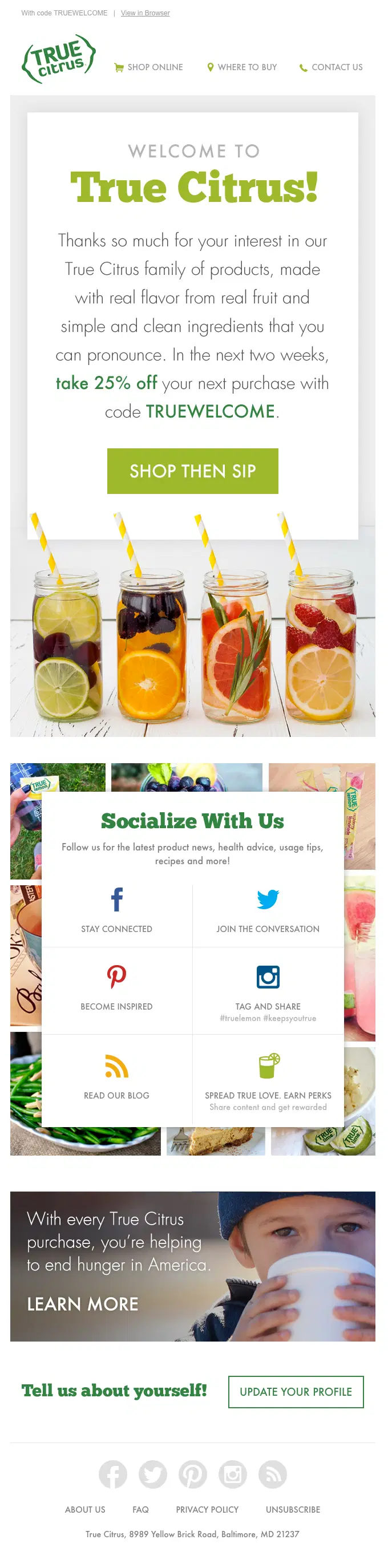
It’s a straightforward brand introduction that delivers on its promise by giving the discount and briefly explaining what they’re about. It’s best when you don’t want to overwhelm your customer, or if there’s no need to give excessive information. They start with a strong opening by saying that they’re using real fruit and clean ingredients to ensure quality, followed by the promised 25% discount.
The email layout is made to lead your attention to the most important CTA, “Shop then sip”. Afterward, there are options to follow them on various social media channels, learn about their noble cause, and update your own profile. While the abundance of actions is not ideal, at least they’re visibly secondary and do not clash with the primary CTA.
2. Wildwonder pairs 10% off with plenty of personality
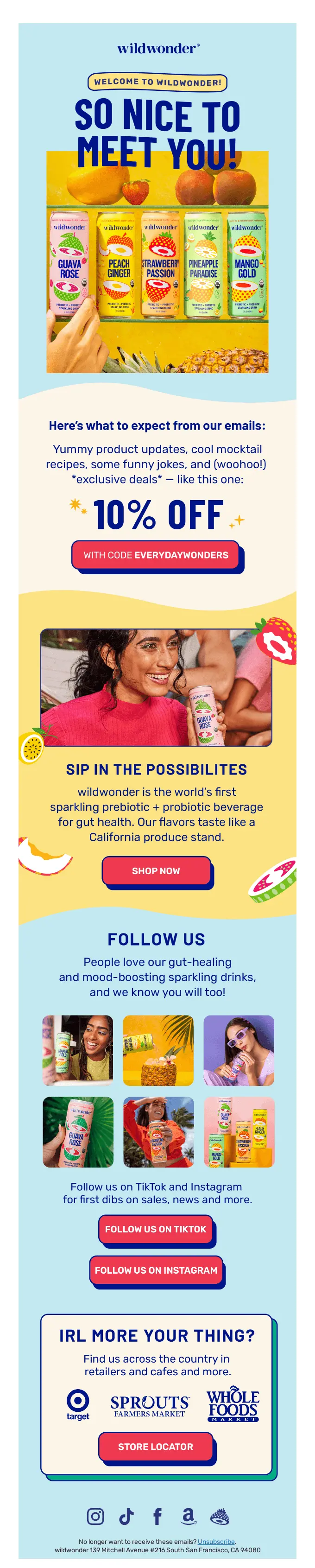
Wildwonder delivers a highly visual welcome email message packed with product images and a prominent 10% discount code with a contrasting CTA button. They clearly highlight what the subscriber can expect from future communications and finish the promotion with a statement centered around health to remove any lingering doubt.
In the remaining part of the email, there are options to follow the brand on social media, and there’s a nice touch focused on people who prefer buying in physical locations; they mention where you can find their product and provide a “store locator” feature as well.
3. Material opens with its founders’ story
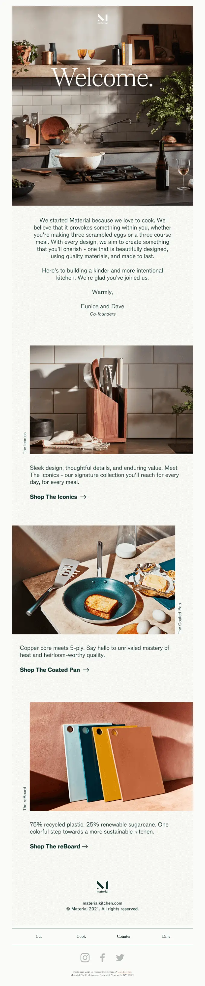
This welcome email is effective because it starts with a story rather than a promotion. It includes a note from founders Eunice and Dave, who explain the problem that inspired the brand. They wanted snack options that were nutritious, convenient, and enjoyable, so they developed the tools to make their own. That immediately gives the email a more personal feel than a standard discount-led welcome message, and the “Shop The…” CTAs invite readers to keep exploring rather than pushing for a hard sell too early.
What we love about this email is the human touch. The founders’ brand photo and signature make the message more credible and personal. The copy speaks directly to health-conscious kitchen shoppers in a natural way. This is a good reminder that a welcome email can create a connection before it requests a purchase.
4. Original Grain spells out exactly what subscribers will get
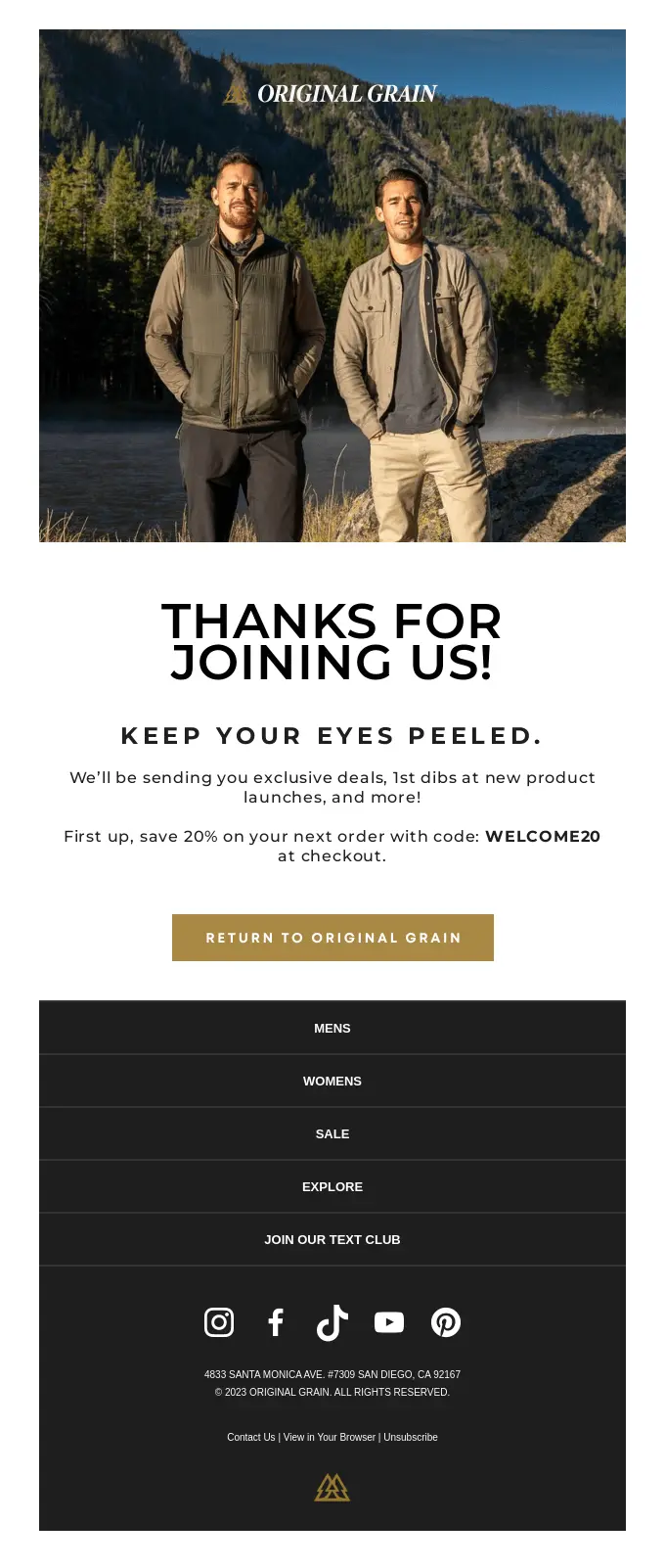
Original Grain makes things clear from the start. The brand doesn’t leave new subscribers wondering what they signed up for; it tells them they’ll get exclusive offers, early access to launches, and brand updates. That clarity helps the email feel more intentional, while the discount adds a strong reason to take action right away.
Simplicity is the most prominent feature of this email: the text is clear, the promise is simple, and the design matches the brand’s outdoor, high-quality image. It shows how a welcome email can set clear expectations and encourage customers to make their first purchase without being too complicated.
5. Withings puts its bestsellers front and center
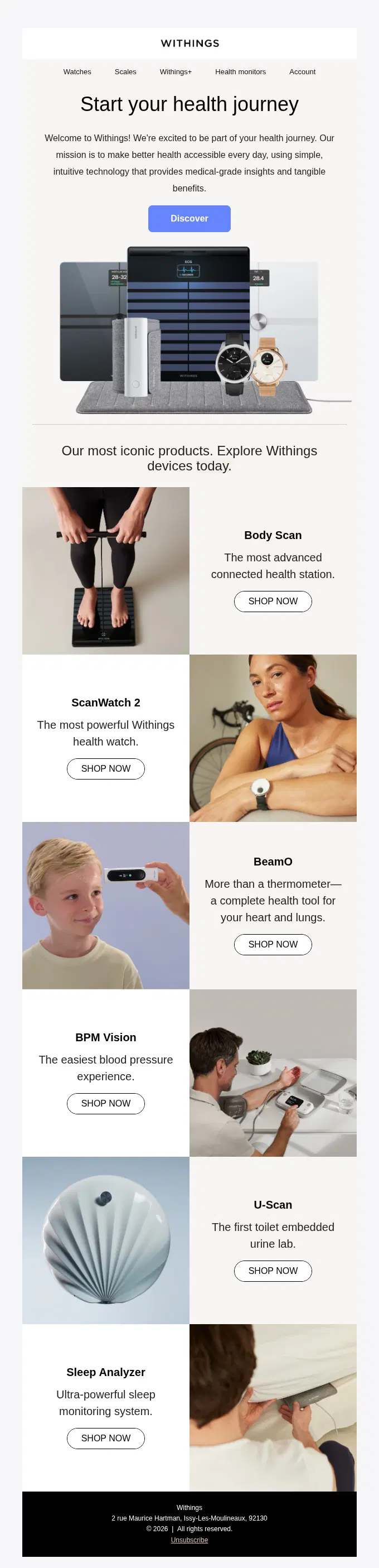
Withings builds its welcome email as a quickly scannable product grid of its most iconic products. It makes a quick introduction and then goes straight into six top-performing health devices with dedicated CTA links.
There are no distractions in this email whatsoever: no social links and no extra buttons. Each item has a one-line description, and they’re focused on different problems. It makes it very easy for the user to find what they need and click on the button to read more about it.
6. Kurk lets its customers do the convincing

Kurk focuses on building trust immediately by dedicating its welcome email to three customer reviews with pictures. They did write a small bit of their own marketing copy for the product, but the main spotlight is on the customers who explain the health benefits they experienced by using the product.
The best part is that the reviews focus on specific problems that the product helped solve: one mentions energy levels and sleep, the other talks about recovering from running, and the last one focuses on inflammation. It’s a good way to show the versatility of your product without praising it yourself or getting into the technical details right at the start.
7. Lyka walks new customers through their first delivery

This email works because it treats the welcome message like onboarding, not just an introduction. Lyka knows a first delivery can come with questions, so instead of jumping straight into promotion, it explains how to prepare: make room in the freezer, avoid snacks for a week, and establish a mealtime routine. That makes the brand feel helpful straight away.
What we love about this email is how useful it is. It lowers friction, sets customers up for a better first experience, and reinforces trust by showing that Lyka wants people to succeed with the product after they buy, not just before.
8. Health-Ade leads with what the product actually does

Health-Ade shifts the focus from a generic welcome to the product’s customer-facing value. Instead of spending too much time introducing the brand, it moves quickly towards the reason someone might actually want to buy: what they’ll get from trying the product in the first place. That approach is especially effective in welcome emails, where clarity often matters more than cleverness.
A benefits-led welcome email helps new subscribers connect the product to their own lifestyle, needs, or routines right away. It gives the message a more practical purpose and makes the next step feel easier. For ecommerce brands, that’s a smart reminder that a welcome email doesn’t always need a long introduction; sometimes the strongest move is showing why the product deserves attention.
9. Go Fast Campers welcomes you into a community, not a store
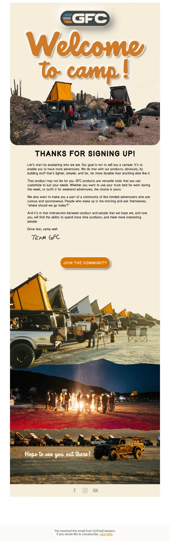
This email welcomes subscribers into something bigger than a product catalog. Instead of pushing straight for a sale, Go Fast Campers uses the message to introduce “Camp GFC” as a community, which helps the brand feel identity-led rather than purely transactional. The brand encourages prospects to join its community first, creating a softer path into the relationship.
The positioning is the most unique part of the email. It suggests that buying from the brand is tied to a lifestyle and a set of shared values, not just a one-off purchase. For ecommerce brands with a strong audience identity, leading with a discount alone can be far more memorable.
10. Yellowbird Sauce turns its welcome email into a mini storefront

Yellowbird Sauce shows new subscribers where to begin. Instead of focusing on just one product or only offering discounts, Yellowbird Sauce treats the welcome email like a simple, guided store. This method benefits first-time shoppers who may already like the brand but need assistance finding their options.
The categories are clear; the visuals do a lot of the selling, and the layout allows for easy browsing without being overwhelming. For brands with several product lines, this is a smart way to handle welcome emails.
11. Blueland shows how it works in three quick steps
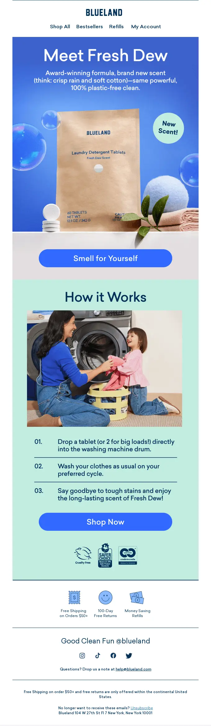
Blueland answers a practical question before the customer has to ask it. For products that aren’t completely self-explanatory, that matters. Blueland uses the welcome email to reduce hesitation, show how easy the product is to use, and keep the path to purchase feeling straightforward.
The best part is that the product education feels light, not heavy. The steps are quick to scan, the visuals help tell the story, and the whole message makes trying something new feel low-effort. For ecommerce brands with less familiar products, that’s a very smart move for a welcome email.
12. Stills creates urgency with early access
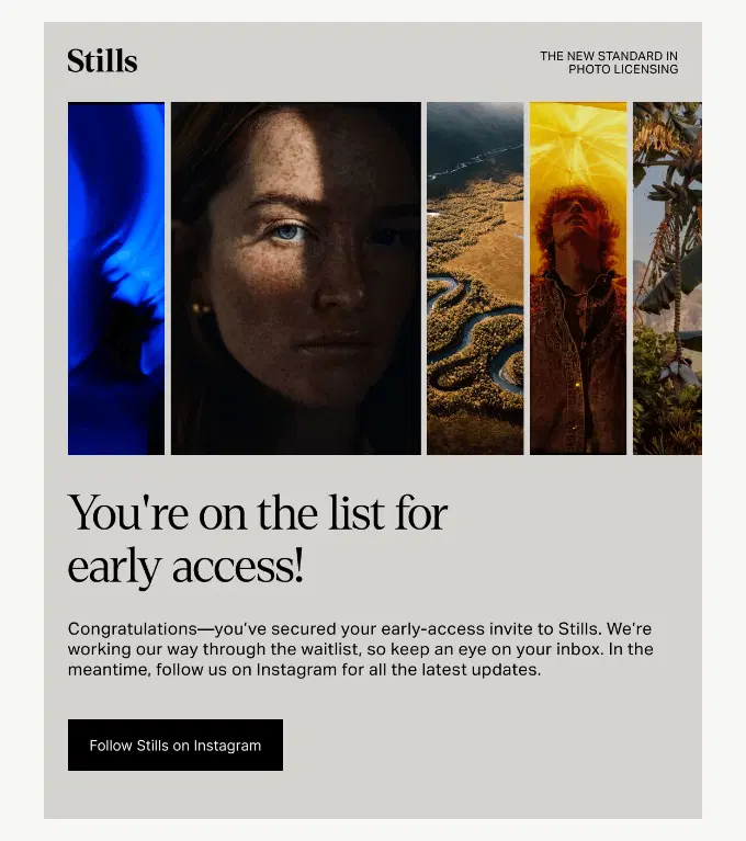
Stills comes with a short and simple welcome email for those who have decided to join the early access invite. They invite the reader to keep an eye on their inbox while they work their way through the waitlist, and follow their Instagram in the meantime.
Since this email only has one job to do, it doesn’t require any more elements or design blocks. It does what needs to be done, so in this case, less is more.
13. The Glenlivet puts a taste-matching quiz inside the email

The Glenlivet starts with a brief intro and then goes right to a short taste-matching quiz that allows the user to make a fast choice based on expert opinion. You can choose how you like to drink your whisky and the flavor that you prefer, and it shows you the perfect choice based on what you selected.
It’s not that easy to put a quiz inside an email, but this one does it exceptionally well. It’s easy to follow and doesn’t involve a million steps. You just answer two simple questions and arrive at the result that you can click on and be taken to the dedicated landing page.
14. Famously You leads with its loyalty program, not a discount
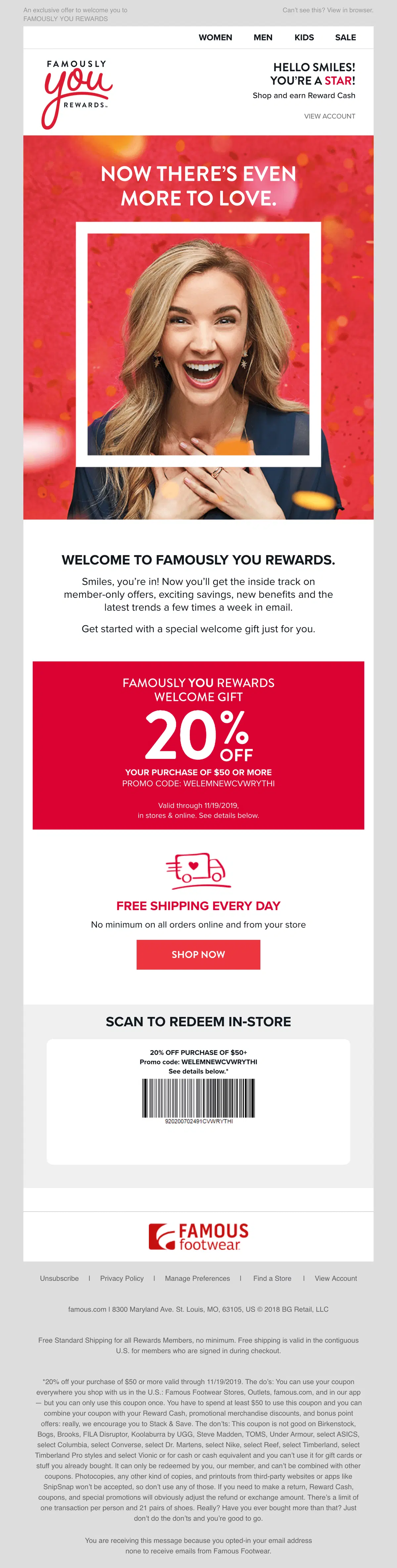
Famously You puts the discount in the second half of the email and focuses on promoting the loyalty program to the user. It promises that the subscriber can expect member-only offers, exciting savings, new benefits, and the latest trends a few times a week.
In the second part of the email, there’s the 20% discount code and a highlighted free shipping feature with no minimum order value. There’s even a dedicated barcode that you can present at the counter in a physical store and get your discount that way.
15. Gen See leads with a relatable situation for a specific audience
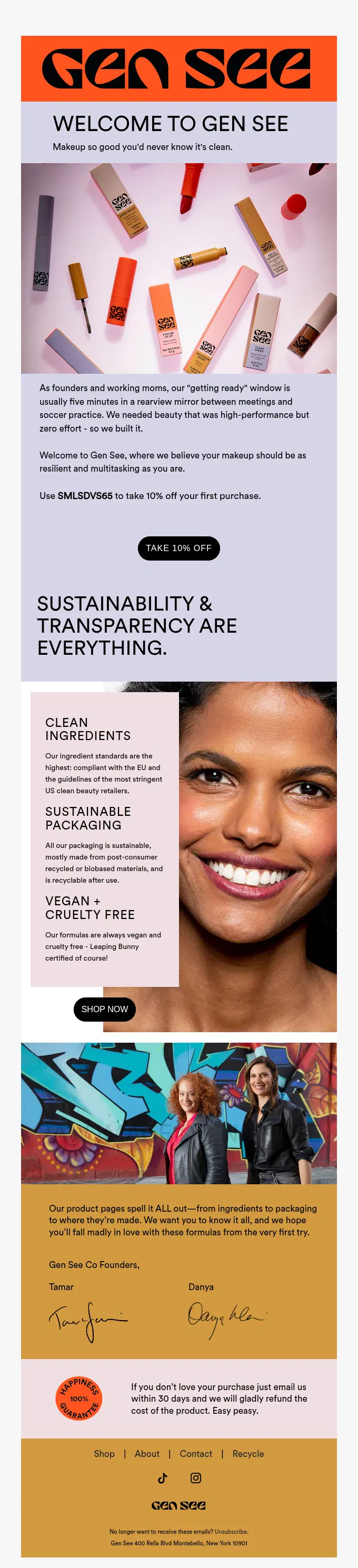
Gen See sends a combo email that covers several different areas: a relatable situation, vision statement, discount code, value proposition, personal touch, and a money-back guarantee. It may seem like a lot for a single welcome email, but it transitions across segments smoothly and works as a complete sales page.
The beginning of the email is the strongest part since it immediately filters out irrelevant audiences and captures the attention of women who are always in a rush between childcare and work. Such products are usually associated with poor quality or questionable sourcing, so the email continues to reassure the customers that everything is clean, sustainable, and cruelty-free.
Key elements of a high-converting welcome email
High-converting welcome emails are composed of five main elements: introduction, incentive, next steps, design, and call-to-action (CTA). Before you select a welcome email template to build your automated flow, you need to understand how to create an effective message.
| Element | Description |
|---|---|
| Introduction | Establishes brand identity and sets expectations for future sends |
| Incentive | Provides a discount or other incentive that attracts the subscriber toward a purchase |
| Next steps | Directs the new subscriber toward one specific action |
| Design | Uses imagery, layout, and typography to create a unified experience across the store and the email |
| CTA | Highlights a high-contrast button that clearly tells the customer where to click next |
A clear introduction to your brand
A welcome email should quickly answer two basic questions: who are you, and why should someone care? That doesn’t mean telling your whole brand story in one message. It means giving subscribers a clear sense of your mission, what sets your products apart, and the kind of experience they can expect from you.
This is also the right place to set expectations for future emails. Let people know whether you’ll be sharing product launches, useful tips, exclusive offers, or behind-the-scenes updates. That early clarity helps your emails feel more intentional and gives subscribers a better reason to stay engaged.
A strong incentive or first-offer
A welcome email should give subscribers a clear reason to take the next step. For many brands, that means a first-order discount, but it could just as easily be free shipping, a gift with purchase, or an early loyalty reward. The exact offer matters less than making it feel relevant and easy to use.
The best incentives lower the barrier to a first purchase without training customers to expect constant discounts. A good first offer should feel welcoming, not a desperate push. Keep it visible, explain it clearly, and pair it with a strong call to action so people know exactly what to do next.
Clear next steps for the customer
A welcome email should never leave subscribers wondering what to do next. Once you’ve introduced the brand and made the offer clear, guide them towards one simple action. That could mean browsing your bestselling products, completing a profile or preferences quiz, or following your brand on social media.
The goal is to keep the momentum going while interest is still fresh. Clear next steps make the email feel more useful and less passive. They also help move subscribers into the right journey, whether that’s making a first purchase, personalizing future emails, or staying connected with your brand beyond the inbox.
Visual design that reflects your brand
The design of your welcome email should feel instantly recognizable. Product images help subscribers see what you sell, lifestyle visuals show the world around the brand, and typography ties the whole message together. Even before someone reads every line, the design should give them a sense of your style, quality, and audience.
That doesn’t mean adding visual clutter. The best welcome emails use design to support the message, not distract from it. Choose imagery that feels consistent with your site and social channels, keep the layout easy to scan, and ensure the overall look reinforces the brand relationship you want to build.
A strong call to action (CTA)
A welcome email should make the next move feel obvious. That’s where a strong call to action matters. Phrases like Shop now, Explore collection, or Start shopping work well because they’re clear, direct, and easy to act on. A subscriber should never have to guess where to click or what happens next.
The best CTAs also align with the email’s goal. If the focus is on a first purchase, send people to a product category or bestselling collection. If the goal is discovery, guide them towards a curated page instead. Keep the wording simple and make the button stand out visually.
How to automate welcome emails
Email automation ensures your new subscribers receive a timely and engaging welcome email, freeing you from manual effort and improving efficiency.
Omnisend simplifies the process with an intuitive drag-and-drop email builder, ready-to-use welcome email templates, and advanced automation features. Its built-in analytics and performance tracking help you monitor open rates, click-through rates, and conversions.
Here’s how to automate your welcome emails step by step using Omnisend:
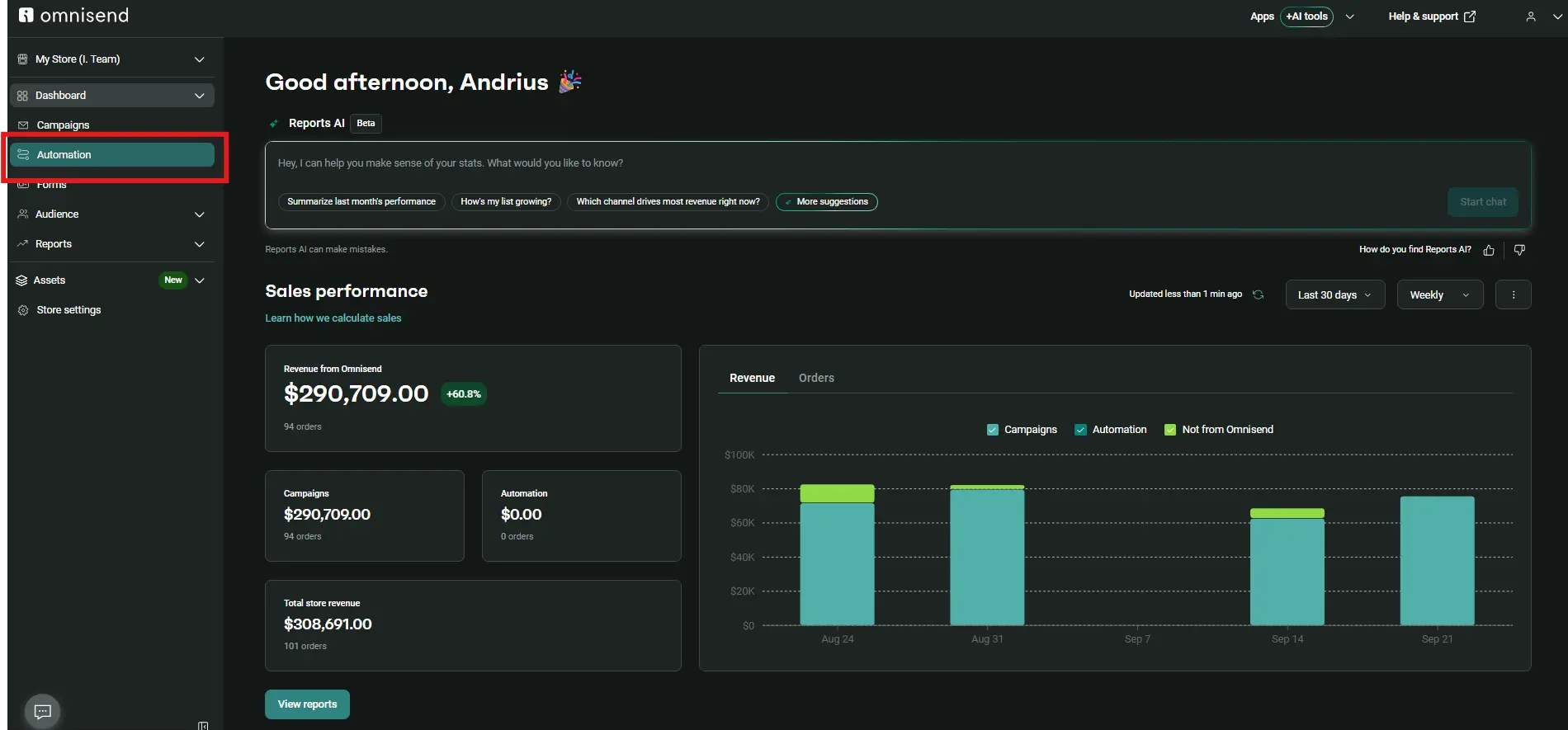
- Sign in to your Omnisend account and navigate to Automations
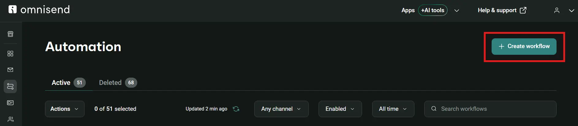
- Click Create workflow
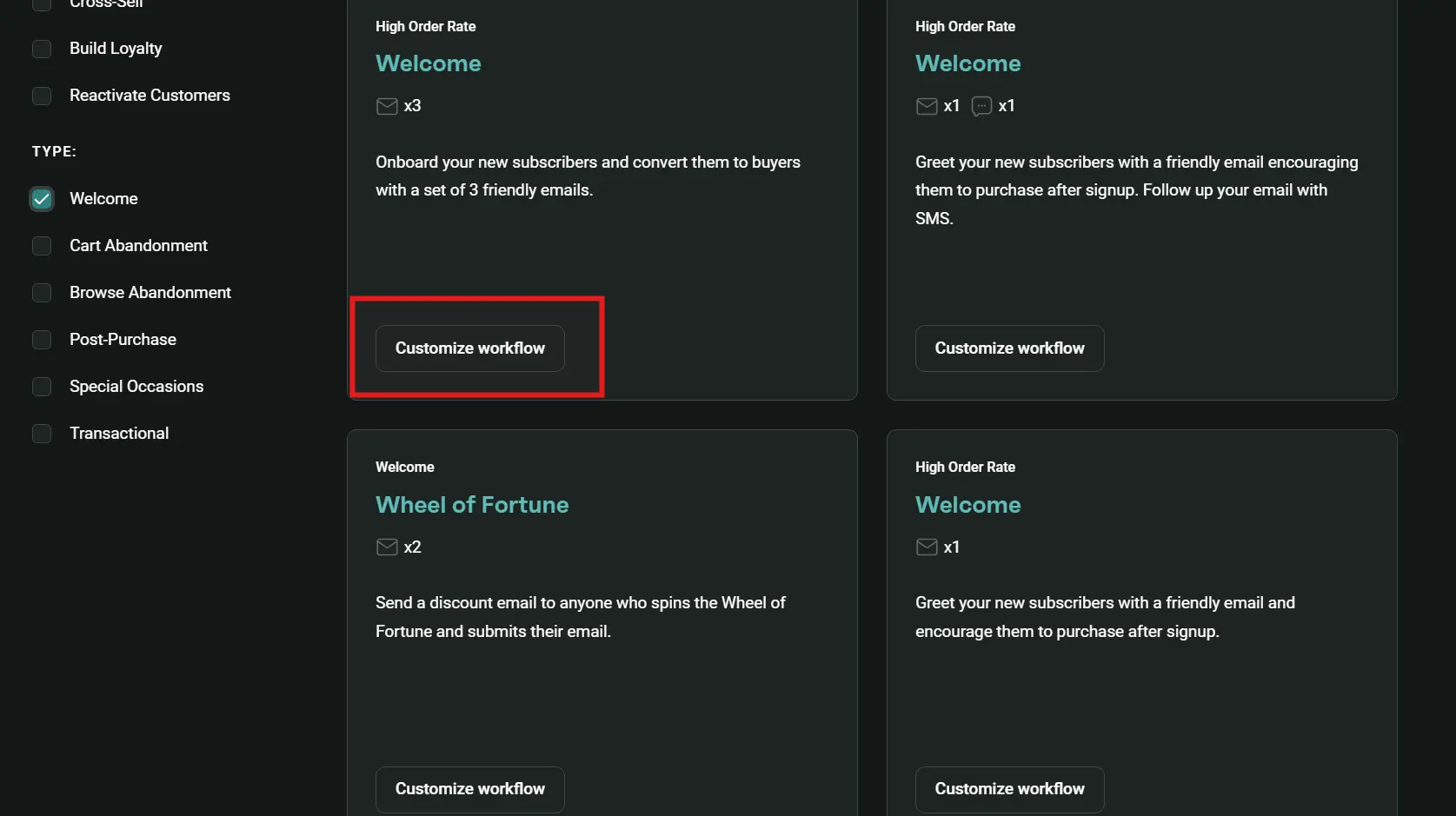
- Choose your preferred welcome automation template and click Customize workflow
- Customize the content and workflow settings and click Start workflow
For more detailed instructions about creating the automation, customizing content, and launching it, visit our Help Center article about welcome automations.
Setting up a multi-email welcome flow
Brands often send a sequence of messages instead of relying on a single email to pace the onboarding experience. They deliver the promised incentive (like a discount) immediately with the first email, and then share their brand story or product education for later emails. You can learn how to map out a multi-email welcome flow in our guide on building a welcome email series.
Best time to send welcome emails
Your email capture form should trigger a welcome email within a few minutes to maximize engagement. If delayed, subscribers may get distracted and forget about your brand.
However, you can also automate your welcome email to be sent at specific times of the day. For example, the best time for opens is 9-11 AM, and the best time for clicks is 7-8 AM and 4 PM. You can try it and compare the results with the emails you send immediately after a sign-up.
You can also use Omnisend’s Optimize Send Time for Better Performance feature, which uses AI to analyze each contact’s historical engagement and automatically deliver the email when the specific subscriber is most likely to open, click, or place an order.
About 12% of Divatress’ marketing messages are sent through automated workflows, including its two-message welcome series. The first email in this series converted at 11% and generated $7.53 in revenue per email.
Segmenting audiences for personalization
Personalizing your welcome emails starts with dividing your email list into diverse groups. With Omnisend, you can group subscribers based on their sign-up source, purchase behavior, or interests.
This customer lifecycle segmentation allows you to send targeted messages, such as exclusive discounts for first-time buyers or tailored content for returning customers. In addition, Omnisend AI can help you create segments you want. You describe it in plain language and get a fully built segment, ready to use.
Here’s a quick Omnisend tutorial that offers the basic knowledge you need to automate your welcome emails:
Omnisend simplify your best welcome emails with automation and fully customizable templates — so you can deliver a polished first impression without getting lost in the setup. Owing to its usability, it has a rating of 4.7 on Shopify and 4.6 on G2.
Quick sign up | No credit card required
Choosing a welcome email format by signup intent
Match your welcome email layout to how the subscriber joined your list, because someone hunting for a discount code expects a different message than someone downloading a free recipe. Your welcome email subject line is the first detail a subscriber sees in their inbox, but the body of the email must immediately deliver on the specific promise made during sign-up.
1. Price-shopping
Subscribers who opt in through a discount pop-up expect to receive exactly that. If you bury the discount code behind founder stories or product tutorials, you’ll create unnecessary checkout friction.
Follow Wildwonder’s format from example #2 and place the discount code with a link at the very top of the email so they can complete the order without additional searching.
2. Pre-purchase research
People who sign up through a product page form are likely comparing your product against competitors, so you need to send content that validates and justifies that first order. You can either use benefit-driven copy from Health-Ade’s example #8 or go with customer reviews from Kurk’s example #6.
3. Lead magnet
Visitors who download a guide or some other educational material are trying to solve a different problem, so a small discount is not likely to help. You can follow Blueland’s instructional layout from example #11 and deliver the requested resource directly. Then, explain in the email how your product works so the customer can be assured it’s within their capabilities to use it.
Ready to create your welcome email?
The fastest way to convert new subscribers is to launch a single welcome email immediately instead of focusing on the best hours or best days to send emails. Welcome emails are behavior-based, meaning the user triggers the send themselves, and likely expects to receive it as soon as possible. Publish your first email with an attractive incentive, make a layout that fits your brand, check the open and conversion rates, and make changes from there.
Already running a welcome series on another platform like Klaviyo? If you have more than 250 contacts, Omnisend’s migration team will rebuild your setup — flows, lists, and templates — by hand in 5 business days, free of charge.
On most contact tiers, the move also lands you at up to 35% less than what you’d pay on Klaviyo for comparable features. If you’re still comparing options, see this list of Klaviyo alternatives before you migrate.
Quick sign up | No credit card required